Difference between revisions of "Tutorials:3D Meshing Part II"
| Line 10: | Line 10: | ||
| − | ==A | + | ==3D Meshing Part II: A Mesh== |
| Line 25: | Line 25: | ||
* Next, I clicked and dragged the upper half to select the four top vertices. Then I went to the Vertex menu and picked "Snap Together", and there you go.<br clear="all"> | * Next, I clicked and dragged the upper half to select the four top vertices. Then I went to the Vertex menu and picked "Snap Together", and there you go.<br clear="all"> | ||
| − | + | ||
| + | ---- | ||
Revision as of 00:27, 17 August 2009
| 3D Meshing Part II | |
|---|---|
| Author | WesHowe |
3D Meshing Part II: A Mesh
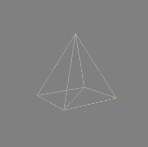
So having learned to pluck points out of space and call them vertices, and to group sets of three vertices together into a triangle face, we can now begin an illustration of actually doing something. Since we are just learning, we will make something simple, and talk about it.So the drawing at the right is a pyramid. Now, drawn that way, it has some of the tricky illusion of looking different as you stare at it. But the closest corner is the lower left one.
This is your very basic mesh. It got that name because on more complex objects it resembles the wire mesh used to support paper-mâché. The illustration shows our object in wire-frame view. In MilkShape, you right-click in the Perspective window and pick wire-frame to get this style of display.
A quick description of how this was made:
- I selected box from the main panel in MilkShape, and then clicked and dragged in the front view to make a cube.
- Then I clicked on the select button, set the option to vertex and turned "ignore backfaces" off.
- Next, I clicked and dragged the upper half to select the four top vertices. Then I went to the Vertex menu and picked "Snap Together", and there you go.
Just like the floats in the Rose Bowl parade, we want to make something more aesthetically pleasing than just a wire frame. To get a nice shaded model (left image), we will right-click and select "flat shaded" from the menu.
Flat shading is like stretching sheets of paper tightly across out wire-frame model. But it is a good place to start talking about the next part we need to understand, the normals.
Now some people think "I'll never be normal", "that boy just ain't right", but I don't mean THAT kind of normal. The normals are a mathematical description of "which way is out". We will start describing a face normal. Face normals are made by creating a vector, or ray, that sits in the middle of the face and points straight out, perpendicular from the face on the front side.
But remember I said a mathematical definition. The normal is calculated in a fashion that results in only three floats being needed. And the sum of all three is less than 1.0, they are all fractions. For as far as we need to understand this as users (not computer programmers) these three values define a point that is straight out from the center point of the face, such that if you plotted a line from the center of the face, through that point, your line would be pointing "out" for that face.
We need to know which way is "out" because to properly shade our object in a fashion that resembles real life, we need to know what angle exists between a light source and the viewer (camera). Inside MilkShape, the light location was fixed in the program, the camera position is what really changes when you move around, and different parts of our object will face different directions.
So unseen, when the object was created, MilkShape created these normals and retains them in memory to use when rendering (drawing) the scene. The effect of shading can be seen best by clicking in the perspective window (you are following along, right?). When you move the mouse you can see the shading change, just as it does in real life when you move a piece of colored construction paper at different angles. This is because some of the light is coming directly from a window or a light bulb, being reflected off the paper, and will be brightest when the paper is at a 45 degree angle between the light angle and the eye angle, and lesser as the angle changes further from this. In addition, there is an ambient component, which in real life is the other light in the room, which comes from the light reflected off the other objects in the room, most notably the walls and ceiling. That's why most people paint them white.
We will study more about normals and smoothing later. Controlling smoothing becomes very important when we start making complicated stuff with both sharp and rounded edges.

