Difference between revisions of "Tutorials:Taking Totally Bitchin Pics/Basic Set"
Whiterider (Talk | contribs) |
|||
| Line 20: | Line 20: | ||
<br style="clear:both" /> | <br style="clear:both" /> | ||
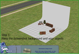
| − | [[Image:bitchinpics-background.gif|left]]If you're planning on removing the background entirely, you may find this item of interest, at [http://www. | + | [[Image:bitchinpics-background.gif|left]]If you're planning on removing the background entirely, you may find this item of interest, at [http://www.insimenator.org/index.php/topic,75000.msg1154452.html#msg1154452 InSim, originally by Sims 2 Mixed Up], an item that shows up under rugs that's like a photo studio background, completely white, and with a curve down to the floor. |
Latest revision as of 12:11, 14 December 2011
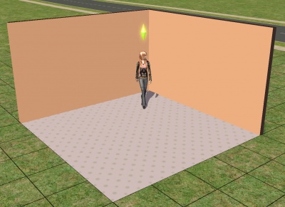
The most basic type of set is just two walls with flooring stretched between them. This will give you nice, brightly-lit pictures, and is perfect for getting a picture of a sim taken against a solid-colour background, often a requirement for contests. If you need some simple, basic walls in a variety of colours, try this set by FionaAzrael at MTS2.
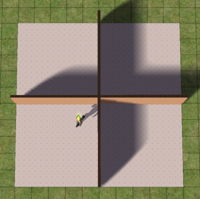
Try placing walls and floors as shown, in a cross shape. Take a look at each corner in the game and notice the lighting. See how only one of those four corners is well-lit on both walls and the floor, the bottom left corner? You would want to place your sim in this corner for picture taking, as it will give you nice, clear, brightly-lit pictures. Placing your sim in any of the other corners, with shadows in them, would give you darker pics that won't look as nice.
You don't need to build this whole cross shape each time, just place some walls horizontally and vertically to see which direction the light is coming from, then build the one lit corner - two walls in an L shape, with flooring stretched between them.
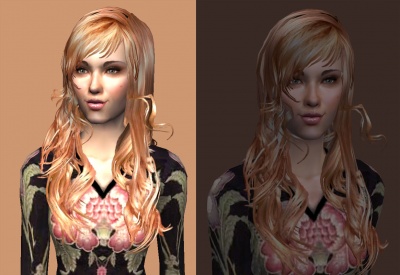
Full daylight will give about the brightest, clearest light you can get in the game, but it can wash out some details, especially if what you are photographing is mostly very light colours.
Notice how certain areas in the brightly-lit pic that are highlighted lose detail - the white parts on her cheeks, nose, forehead, and chest, and a little bit on the design on the front of her shirt and in the highlights of her hair, there is a loss of detail due to brightness. You don't get that same loss of detail in the darker pic, and there is more depth to the colours, but there are also no bright highlights at all, and the low-contrast makes things look muddy.


